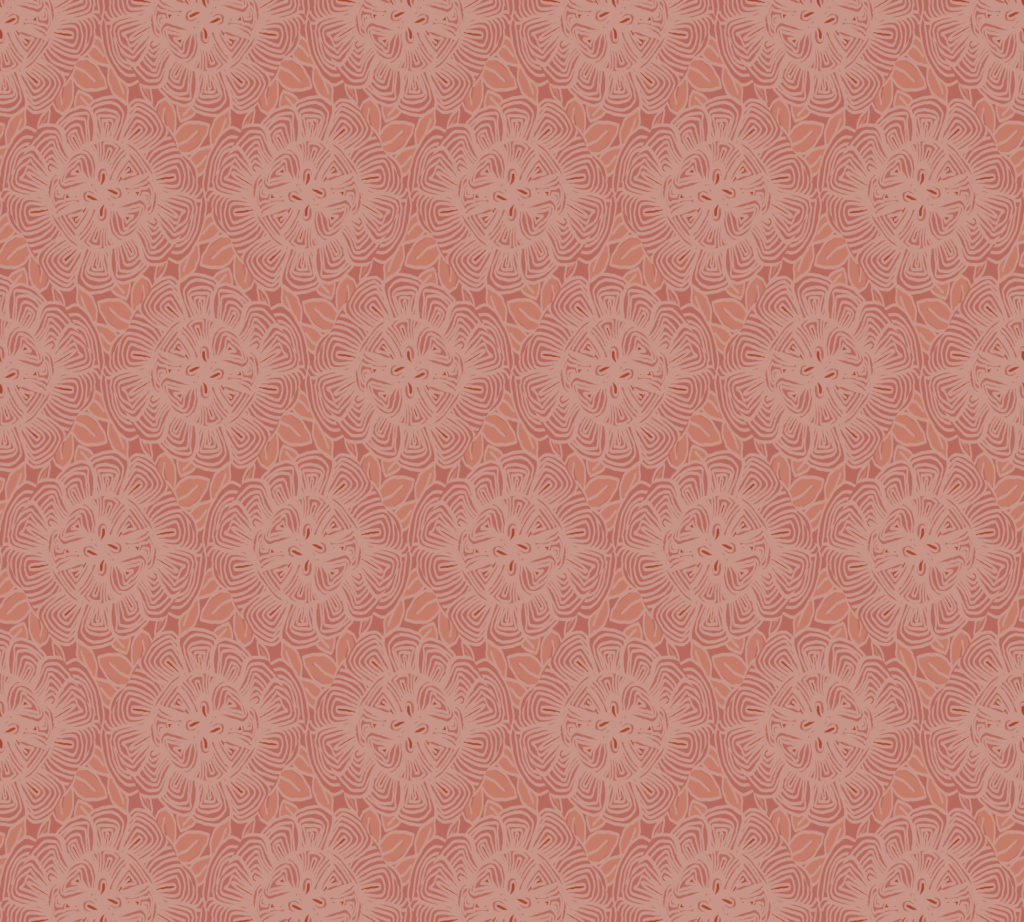

One of my favorite things about designing for Spoonflower challenges is that a single prompt can become much more than one finished print.
Sometimes a challenge design is simply a fun one-off. But sometimes it feels like the beginning of something bigger—a full collection with coordinating prints, multiple moods, and more ways for people to use it in quilts, sewing projects, wallpaper, and home décor.
When that happens, here’s how I usually build from one hero print into a complete collection.

1. First, it has to feel like me
I don’t expand every challenge entry.
The first question I ask is whether the design feels at home in the visual world I’m building. Does it reflect the kinds of motifs, colors, atmosphere, and storytelling I want my portfolio to be known for?
If the answer is yes, it becomes a candidate for expansion.
I’m also drawn to prints that add something new—perhaps a motif I haven’t explored before, or a pattern layout that gives my portfolio more variety.

2. Audience response can be a helpful clue
I trust my own instincts first, but I also pay attention when a design receives strong engagement.
Likes and kind responses aren’t the whole story, but they can be a useful sign that a motif, palette, or mood is resonating with other people too.
When a design feels true to my style and people respond warmly, that’s exciting.
3. My second print is usually an easy breezy blender
Since the challenge entry is always a hero print, I often create the easiest companion next: a blender.

This might be a stripe, dot, or simple low-complexity repeat. A blender gives the collection breathing room and adds flexibility for buyers who want something quieter to pair with the statement print.
It also helps a collection feel immediately more usable.
4. I like to rebalance the palette
One of my favorite ways to create variety is through color-role changes.
If a shade plays a supporting role in the hero print, I may let it become the star of a companion print. For example, a color that felt like 20% of the hero may become 60% of the blender.
That keeps the collection coordinated without making every print feel the same.
5. Then I create an opposite print
My next companion often plays the role of contrast.
If the hero print is dark, I may make this design light. If the hero is dense, I make this one airy. If one small motif in the hero deserves more attention, I let it take center stage.

Collections often feel stronger when each print has a different job.
6. I finish with a textural microblender
For my fourth print, I often create a subtle microblender.
This design usually gives more space to an accent color that only appeared lightly in the hero print. If someone falls in love with that particular shade, this print gives them another way to bring it into their project.

It’s a small detail, but I think it makes the palette feel more generous.
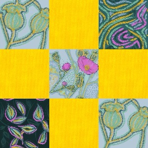
7. My final test: can it build a quilt block?
Before I consider a collection finished, I like to test it in use.
I have a quilting app on my tablet that lets me build simple quilt blocks from PNG swatches. If the prints create enough contrast, variation, and unity in a block, I know they’re working together.

That tells me the collection isn’t just attractive individually—it functions as a set.
Why I love this process
A single challenge entry can be the seed of something much richer.
What begins as one print can become a coordinated little world of color, pattern, and possibility.
And for me, that’s one of the joys of surface design.
Explore More
You can browse current collections and see where some of these ideas have grown in my portfolio, or visit my Spoonflower shop to see available designs.